As I mentioned in the q&a post about our new place, we bought a new construction duplex up before it was completed, so we are able to choose some of the finishes! Huzzah! Mainly hardware, lighting, and faucets.
Below is what the kitchen would have looked like with the builder’s selections. We got to go through one of his finished properties to see. Very lovely! But since we had the opportunity to customize, we jumped on it.
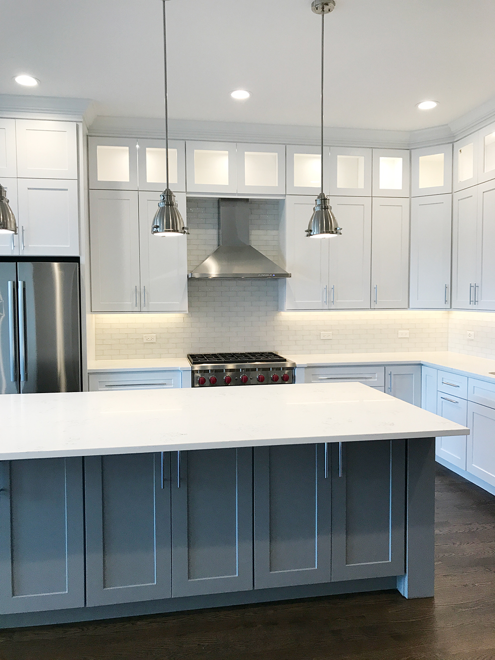
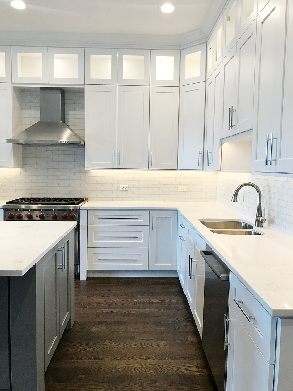
The only things that had been installed already when we toured what will be our place were the cabinets… so we got to choose:
- countertops
- hardware
- lighting pendants
- backsplash
- sink
- faucet
First request: ask to change the sink for a white farmhouse sink. Request granted.
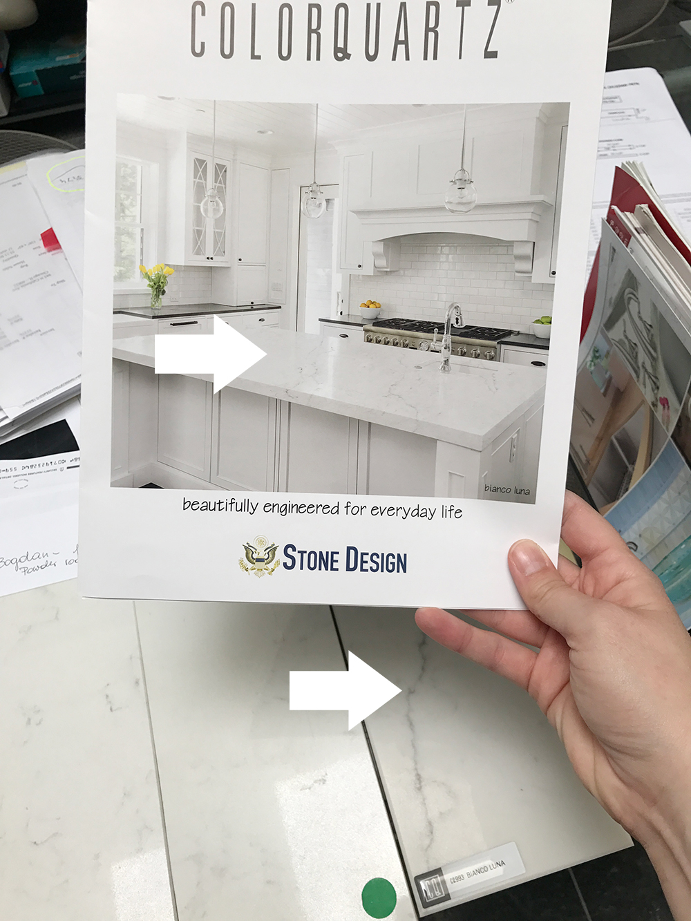
Second: head to stoneware shop to choose countertops! Boy was this overwhelming! I ended up with Bianco Luna Quartz which was slightly different – more natural looking – than the speckled version he was using.
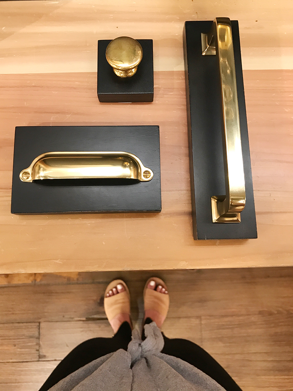
Third: head to Rejuvenation for hardware!
Fourth: make a slight change to the backsplash. I asked for traditional 3×6″ ceramic subway tile. The one he used in that other house was a bit smaller and glass – which was actually more expensive. But I like the traditional subway w/ white grout!
Fifth: choose and order lighting fixtures!
Keep in mind this all had to happen in a matter of… four days? Haha yes. Things are moving quickly!
So here’s where we’re at!
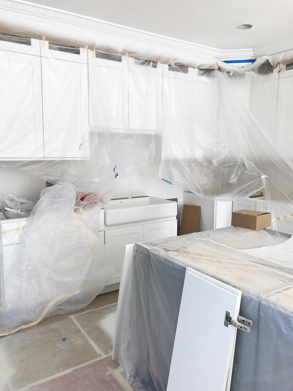
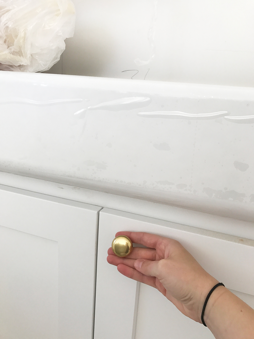
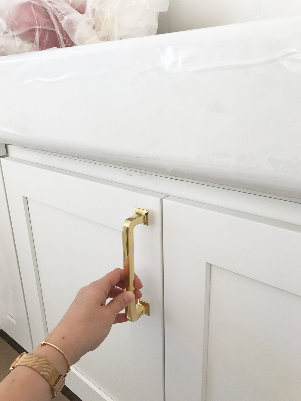
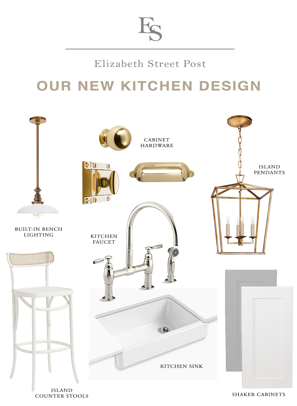
I was able to change up the sink for a white farmhouse sink! The builder chose a style like this from Kohler. Makes SUCH a big difference, I’m so glad I was able to make this switch!
And for a faucet we are doing a bridge faucet, also from Kohler. Years ago, I noticed Erika McPherson Powell of Urban Grace Interiors put these in almost all of her kitchen renos, and I fell in love with the look. We’re going with the Parq from Kohler in polished nickel.
I am also changing up his choice of cabinet hardware for brass hardware from Rejuvenation! I really really really loved how this oversized 6″ handle pull looked (shown above, as opposed to a traditional 3″ or 4″ pull), but because of the stacked cabinets, I ended up going with the simple round knob for all cabinet doors. The cabinet drawers will have a traditional bin pull in unlacquered brass, and the built-ins in the family room – which is basically a continuation of the kitchen cabinets – will have these old-school latch pulls that I absolutely love and am so so excited for.
We are finding out if changing the color of the kitchen island is an option. It’s currently a medium gray. I’d do a beigey color, a crazy light grey, white like my faaavorite kitchen, OR a muted light blue. Hah clearly I don’t even know what I’d want! TBD!
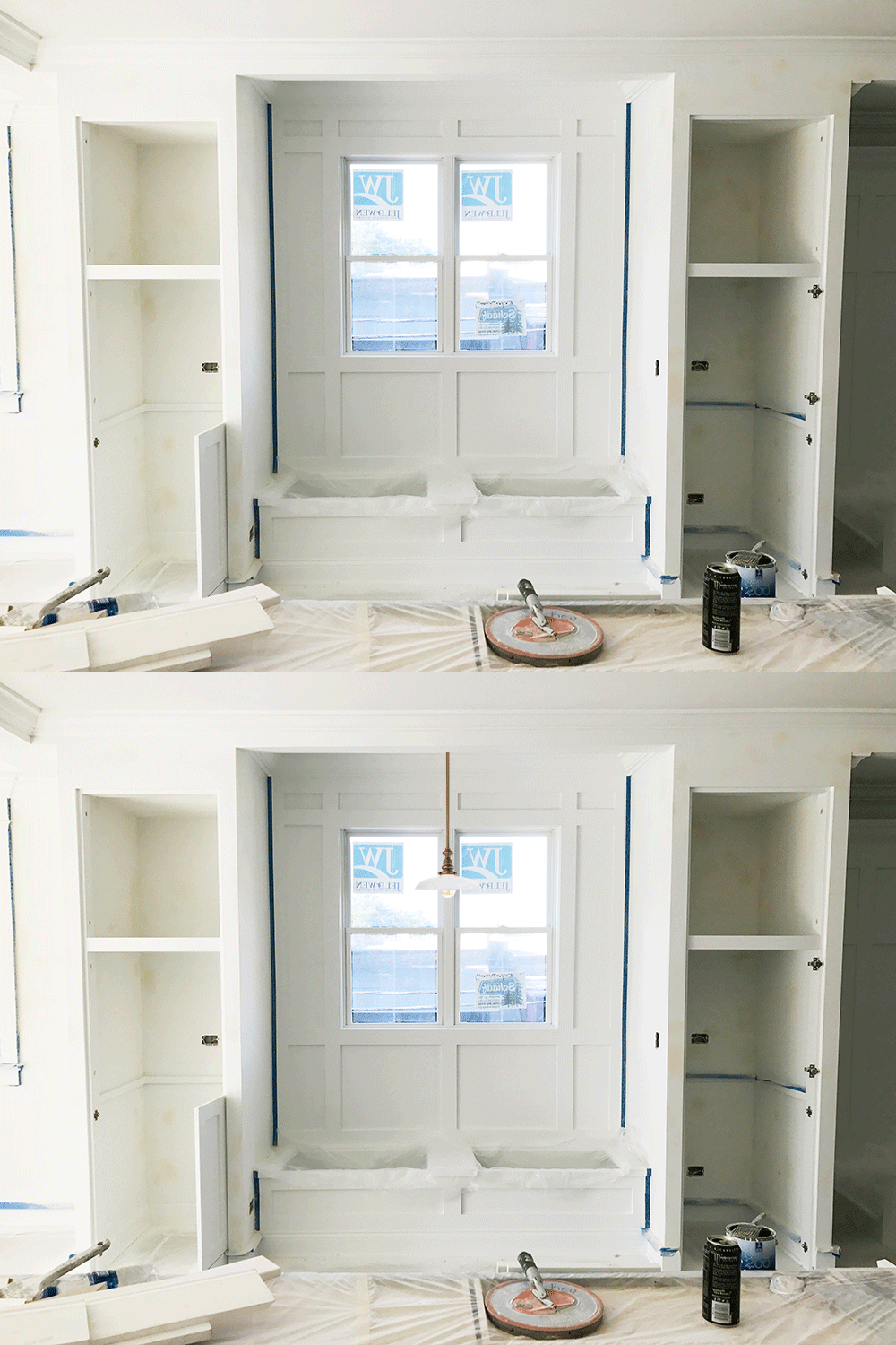
When I walked through the place the other day, I discovered there is wiring for a light fixture above the built-in bench space so I ordered this dainty pendant fixture that I am obsessed with.
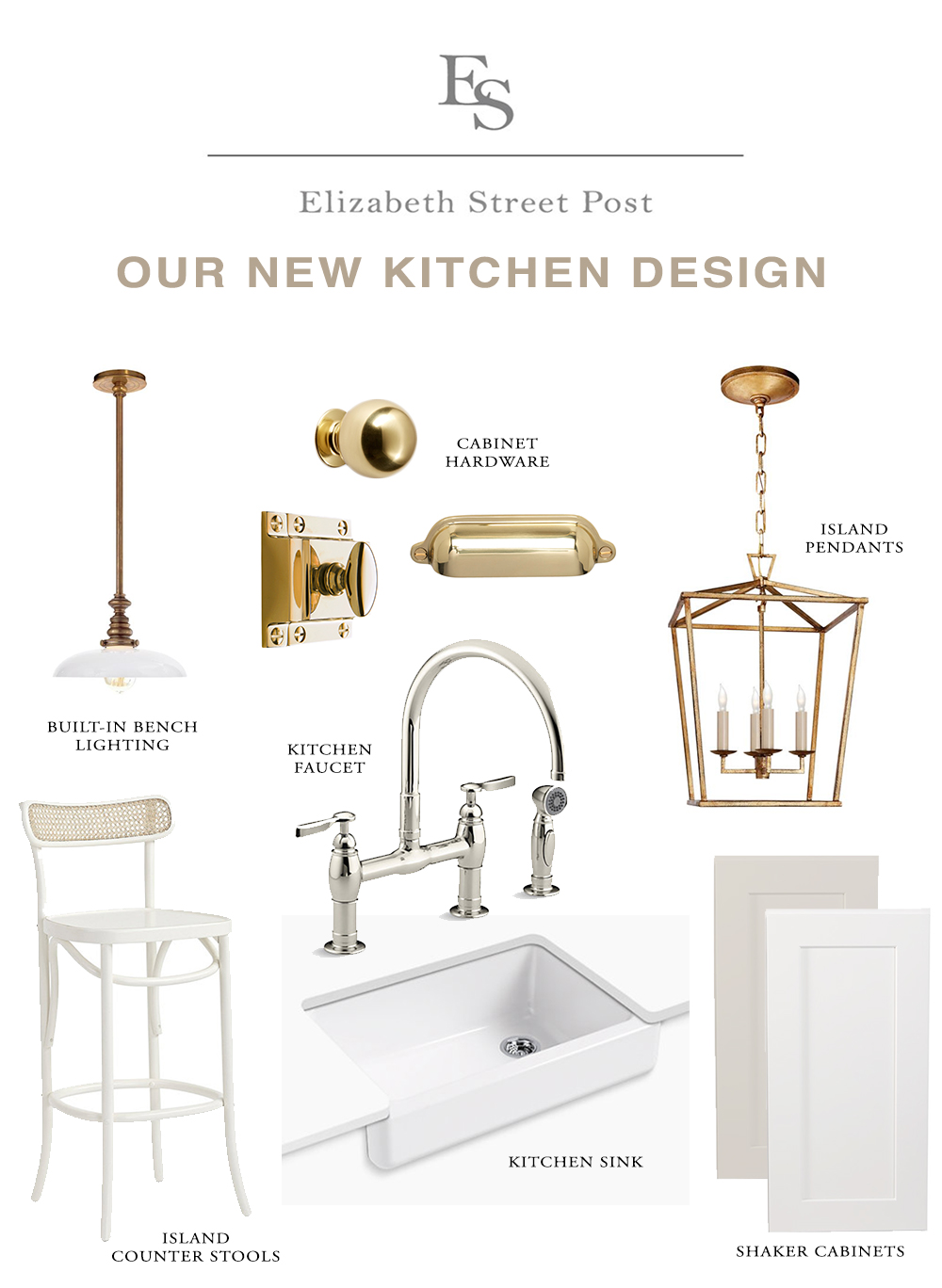
I am 98% certain we’ll be putting these counter stools along the kitchen island unless I find something else I love more which I highly doubt I will!
The two island color options are:
a beige color like so:
….or a light blue island like below, which is gorgeous and you all LOVED the idea of on insta! I am just struggling with vision for the rest of the home so while I want a homey, family-esque style, I don’t know where to begin / cannot get a ton of new stuff. Zoiks.
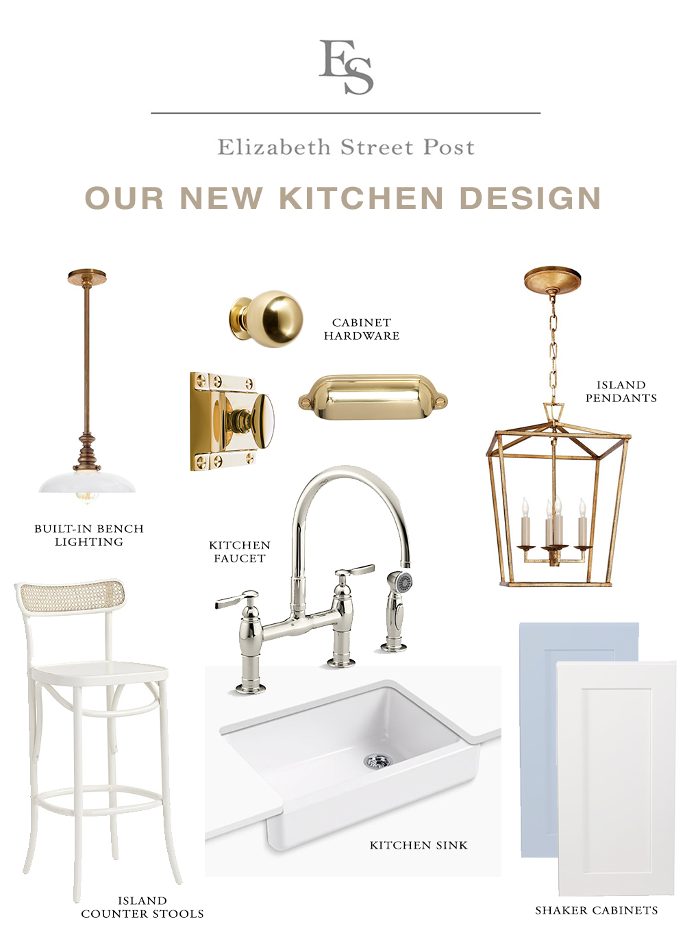
So what color kitchen island?!
1.Keep it dark grey like it is
2. Paint it beige
3. Paint it light blue
3!
Looks awesome! Is your builder an Irish fellow by chance? (I know you’re not sharing name until you close). If so I think we have the same dude because the original kitchen design is a dead ringer for mine here in WP!
I haven’t met him – I’m not sure!
Gray!
Beige ?!
Go blue!! 🙂
Blue. 100%. It looks dreamy with the brass details. Loving all these house posts!!
Keep it gray for resale purposes and make sure to get a can of the color for touch ups – trying to color match grays, whites, and beiges stinks. We just bought and moved into a home in Bucktown with an eerily similar kitchen (white cabinets, medium gray island) including the Kohler bridge faucet, but I believe ours is chrome ??. I would definitely prefer Polished Nickel as well.
Beige all the way!! ❤️
Omg go for the light blue!!!! If you hate it, you can go back and paint over it in a few months. As you once said, “it ain’t no thang!”
I am living for the beige! The gray is somewhat overdone now and the beiege I believe will be more popular in 3-5 years when you guys sell again!
3! Love love love the blue!
I say #2 since it appears to be so open to the other spaces, and you could still bring in that blue with decor pieces that are less of a commitment?? But I’m doing an all white kitchen, so I may be biased! Also, props to you for making such quick decisions, I’m 9 months into a whole home reno and still keep going back & forth, on some stuff! It’s so much easier to tell someone else what to do, ha!
Love the beige! Our whole house is a pale greige, and I absolutely love how it changes with the light.
Ligtj blue, soooooo pretty with the gold accents!!!! Please!!!
Gray!!! It will look so much better with your new counter selection and it’s a very rich combo with the brass hardware. Do get touch up paint as you will need it. Check if you can get an electrical plug on the side of your island. It will be handy and you will use it. Check the size on the overhang – you might want it a little larger to slide the stools in and for more comfortable sitting. Also, keep looking for stools-the ones you have chosen look a little out of scale with the size of the island-to lightweight. It’s all looking terrific and save the blue for accents-it’s Henry’s color!
So exciting! I think the blue is the prettiest option but grey is probably safest for re-sale (even more so than beige).
Beige or blue! Gray is so over done.
3 for sure!!
BLUE!! I love it. Different yet still neutral and looks fab with gold. As others have mentioned, you can change it later. Or yearly! Which sounds like fun to me (but in actuality might be a pain, but still! Lol). One thing we did when we moved which sounds silly, but makes me happy to this day is organizing the INSIDE of the cabinets. After living with stacked pots and pans and hard to reach items way in the back, I made a point to spend a couple of hundred dollars on organizers, sliding cabinet things (where you install them in your cabinets and they are on a track with wheels and you can pull them out and easily access things in the back), plate racks, spice risers-i call them spice bleachers!-etc. Hit up homegoods/TJ Maxx and Bed Bath & Beyond, before going to places like the container store. They often have the same thing for less. But container store does have everything. When I open my kitchen cabinets, even today, it makes me happy that the pot and pan tops are all lined up on a rack, our pans have their own rack, I can see all those random spices I bought for 1 recipe, I don’t just have a drawer with all the oversized spoons and spatulas swimming around…It’s all in it’s place! Love it!
Blue!!!
BEIGE!!!
I am all for the taupey beige one! I won’t commit to color, and with the trends changing so often now, I would be desperate to be constantly changing it. Of course you can paint it later, but I feel the taupey beige is perfect.
2- beige orrrrrrr black!!!! I’m so surprised you don’t have that as an option since you usually do black and white! 🙂
haha black has just been my go-to since it’s so easy to give cheap rental cabinets a facelift! But I’ve been doing it for years so kind of ready for something new! 🙂
Paint the island white!
I like the blue! Goes with the more casual vibe you seem to be going for … would look great with the cane back of those barstools!
I choose beige! I think it’s a fresh take on an all white kitchen! Blue is gorgeous, but it’s becoming so popular and kind of trendy. Save the color for your family room space!
Beige! We have medium gray cabinets and love them but realllly wanted beige. I think it feels much cozier and more classic!
Blue!
Greg- I feel like grey and brass are having a moment together right now and can look so beautiful! That being said, not sure the grey goes as well with the seating, etc.
Beige- looks amazing with the chairs you’ve chosen and is the most consistent with your aesthetic.
Blue- fun! but very different. Could you lighten the blue a bit? I adore Julia Engel’s (Gal Meets Glam) kitchen which is a subdued, powdery blue. The one above is reading more baby blue? Such a tough decision! Love them all!!
Blue!!
Yas Beige! It gets a bad rap, but would feel so elegant and warm with the nickel and brass. I love a blue island also, but not in love with specific shade shown.
Excited to see it finished!! ?
Light blue would be gorgeous but white is a close second. Stay away from beige!!
1 or 2!!!!
Light blue!
I love the idea of a more muted tone with the gray or beige- I think it would look really sleek! But something about the blue really speaks to me! The pop of color would really add something special and unique. Your aesthetic and design choices are always spot on so no matter what you choose will be great. Congratulations on your beautiful new home! Xoxo
I actually quite love the current colour but I get that this may not be the look you’re going for. I’m sure whatever you chose will be lovely
Beige! Add more easily replaceable blue accents instead ???
Blue!!!
Beige is so blah, and grey is a little over done at this point. Plus blue and brass so chic! Plus it’s just paint, why live with something for several YEARS that is so easy to change for resale in the future. Be happy and live in the moment!
I actually think you should paint it beige! What about Benjamin Moore Classic Gray?
Light blue
Keep it dark grey or beige. I feel like it will be more timeless than a blue 🙂
Beige is giving me Nancy Meyers vibes, so clearly that’s my vote!
Blue!!! It just seems so cheerful 🙂